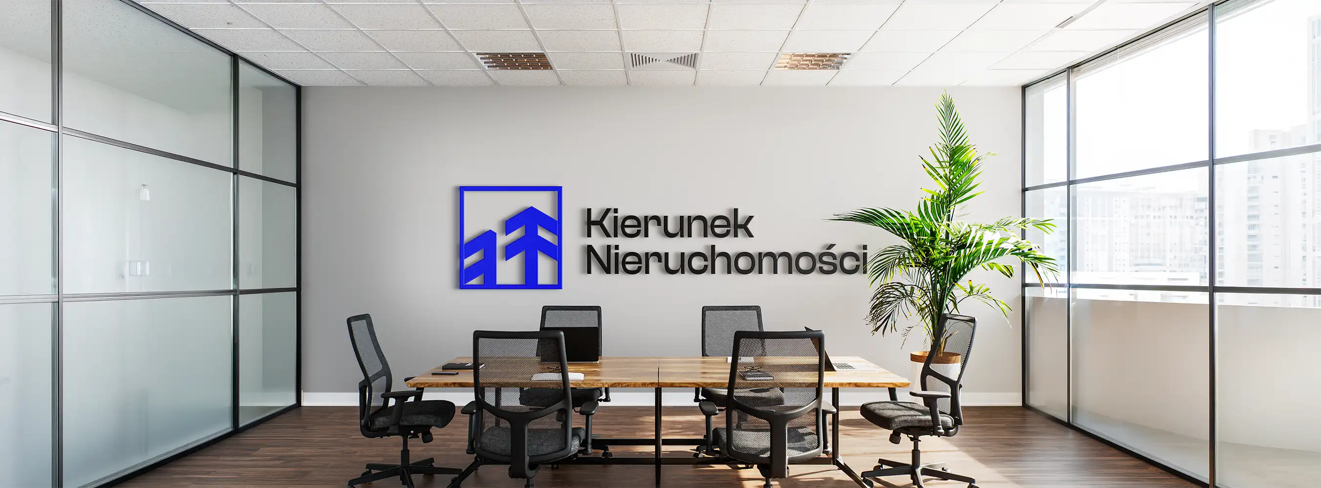
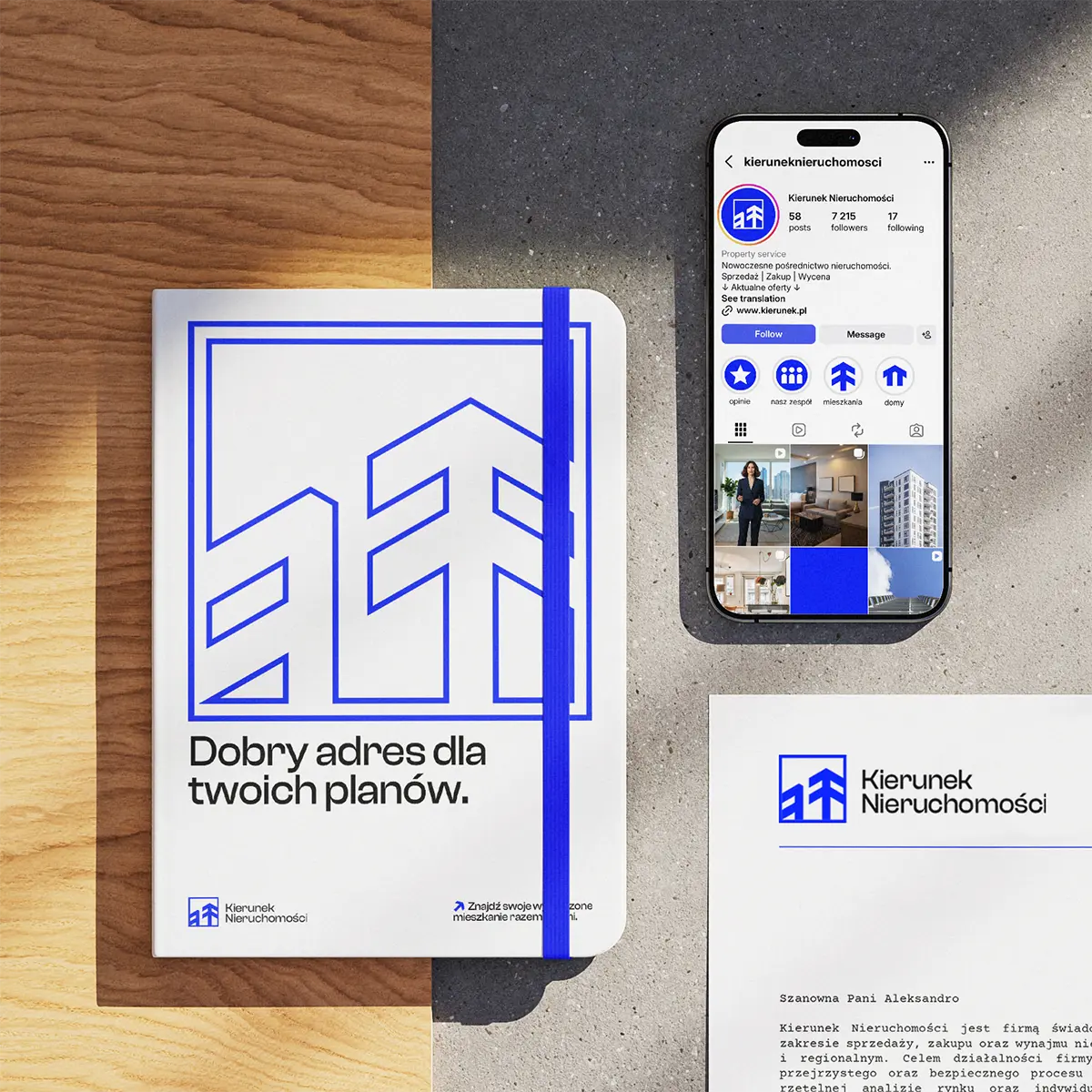
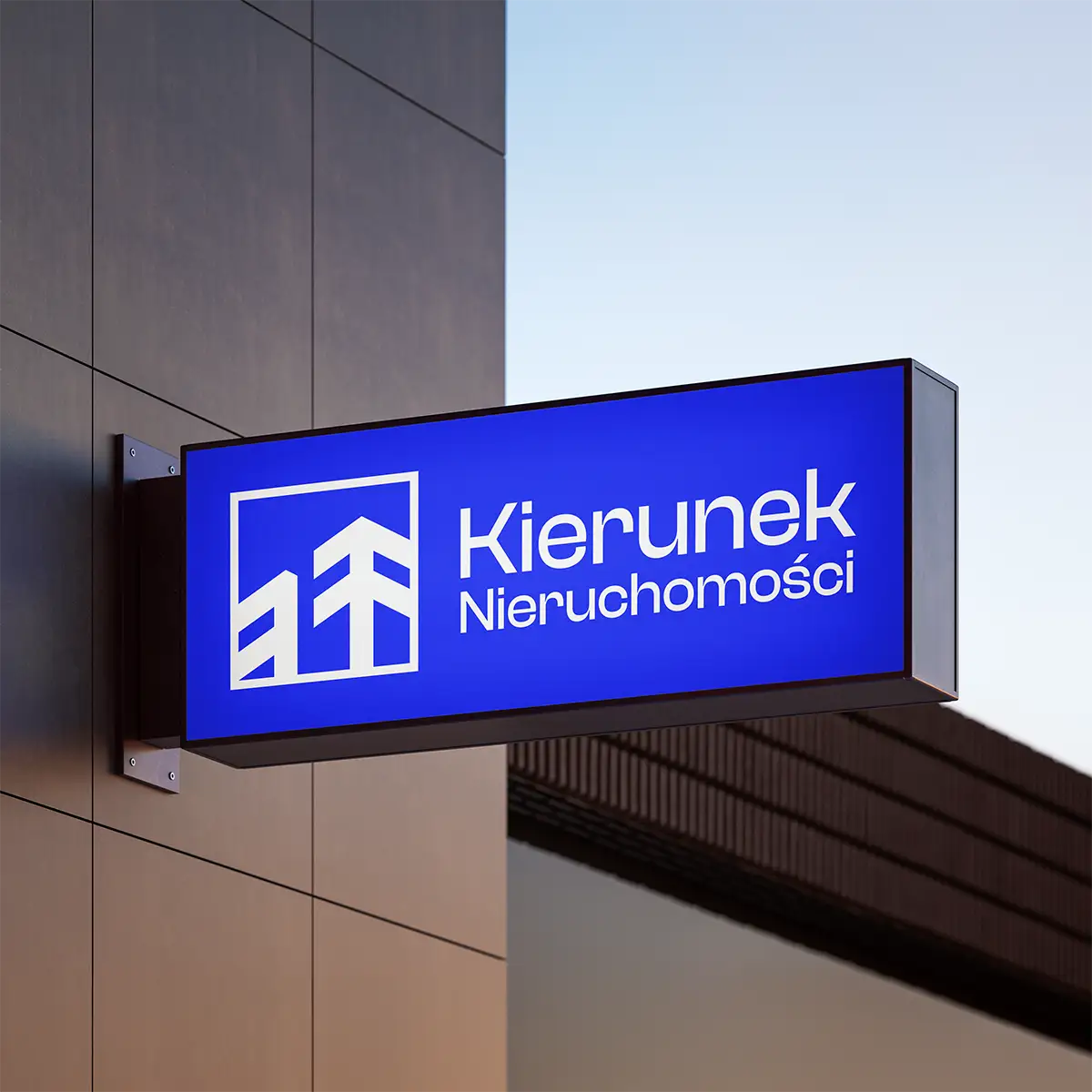
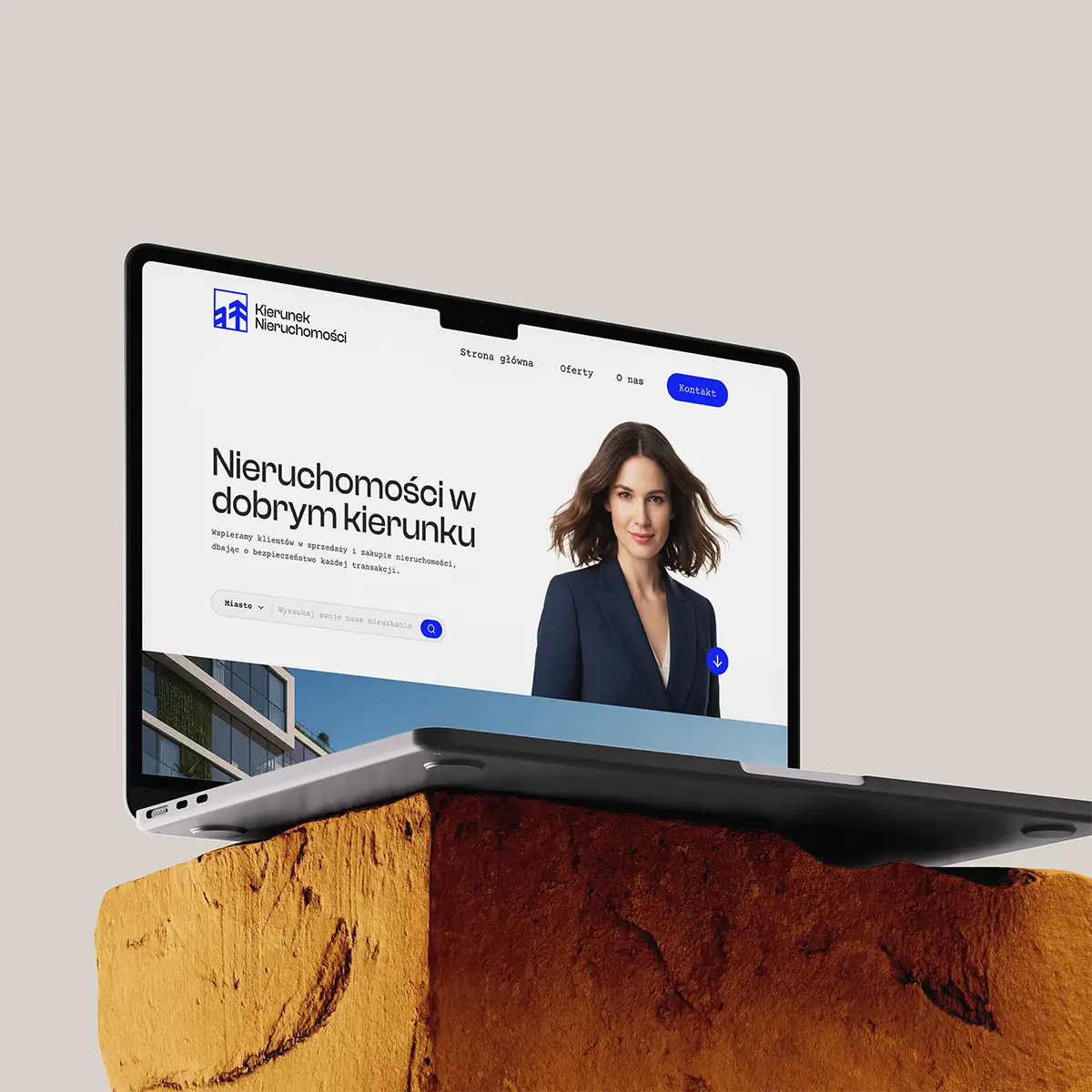
At Kierunek Nieruchomości, the main goal was for the company to feel trustworthy and approachable. In real estate, it's easy to go cold and corporate. Here, we kept the warmth in every touchpoint.
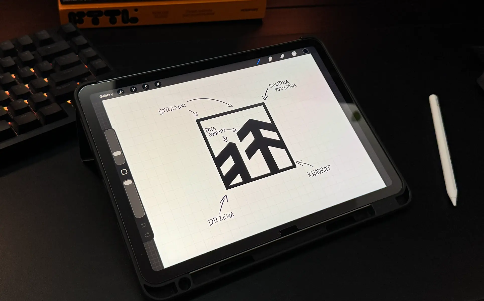
The mark has a closed form, giving the brand a sense of solidity. A cornflower blue paired with a light backdrop and oak wood makes the brand look professional without feeling distant.
BRAND IN PRACTICE
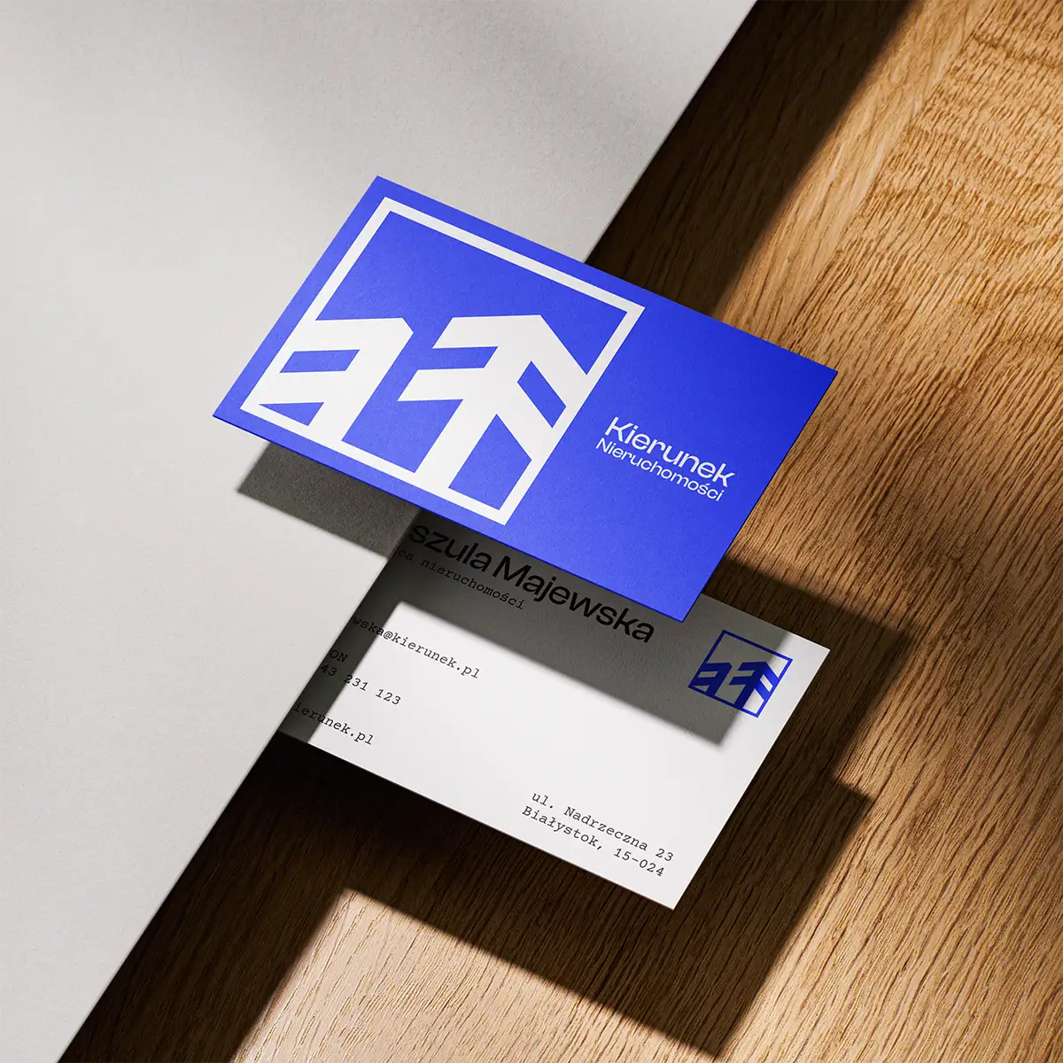
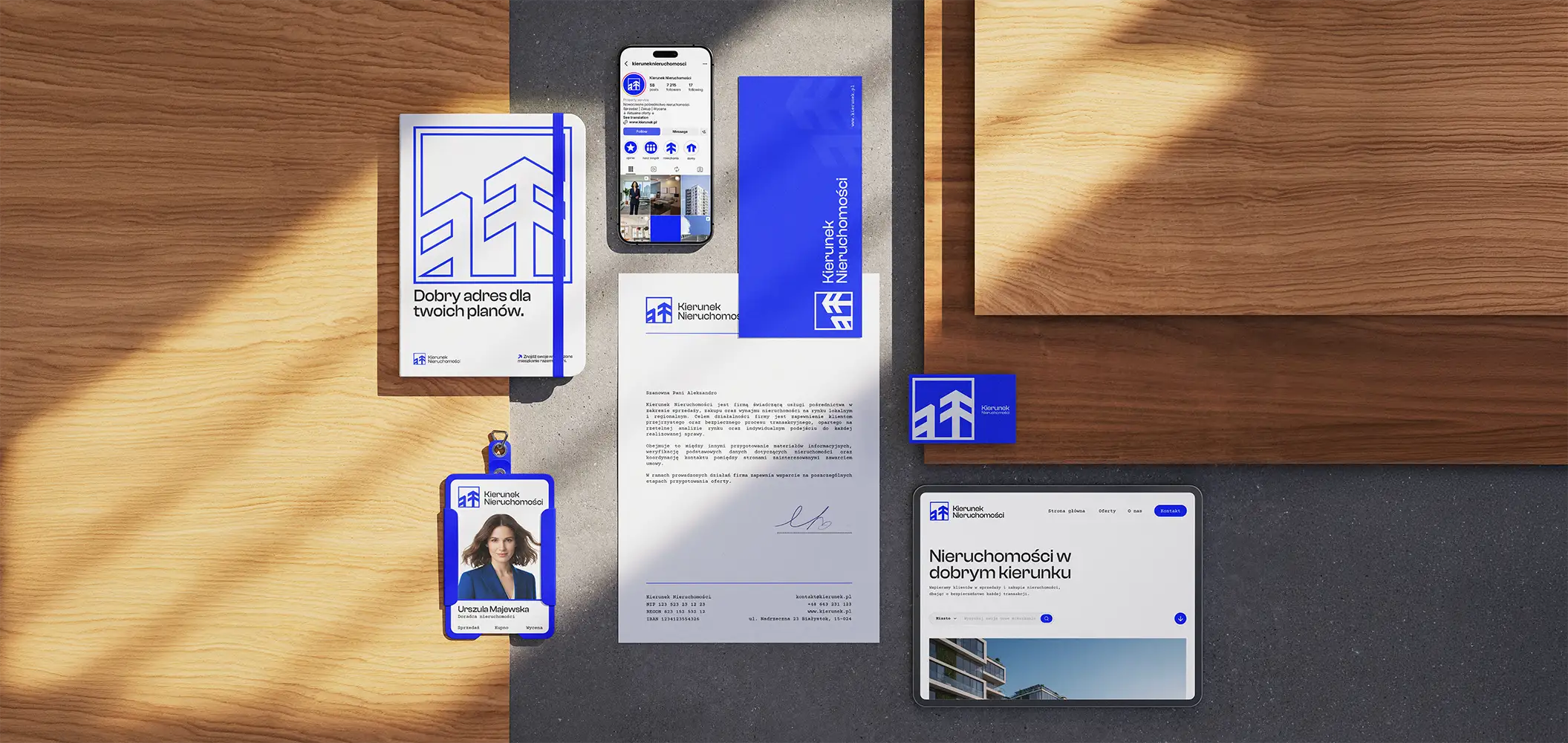
The entire system was built from the start for everyday use, primarily in materials like business cards and stationery. Everything had to feel clear and reflect the transparency of the company.
The result is a brand that builds trust and targets larger projects, while remaining approachable and working well in everyday client contact.
IT'S NOT OVER YET...
If you want to get to know my style better, take a look at my other projects.