A NEW DIRECTION
For Kierunek Nieruchomości, the core idea was to create a brand that feels trustworthy and open. In real estate it is easy to fall into a cold, corporate aesthetic, so here we kept the identity warm and approachable.
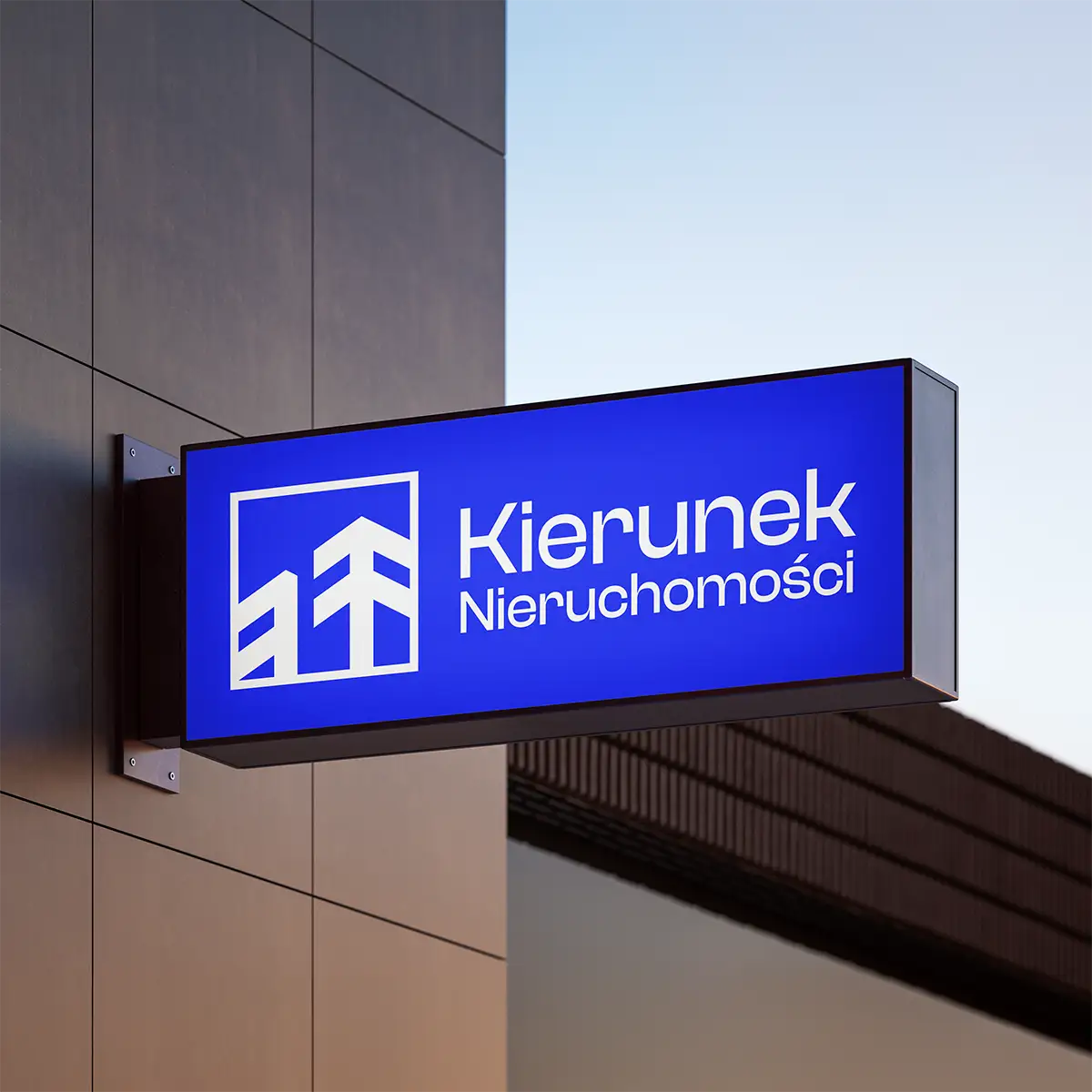
The mark uses a closed form to convey stability and security. A cornflower blue paired with a light background strikes a balance between professionalism and warmth, keeping the brand from feeling distant.
BRAND IN PRACTICE
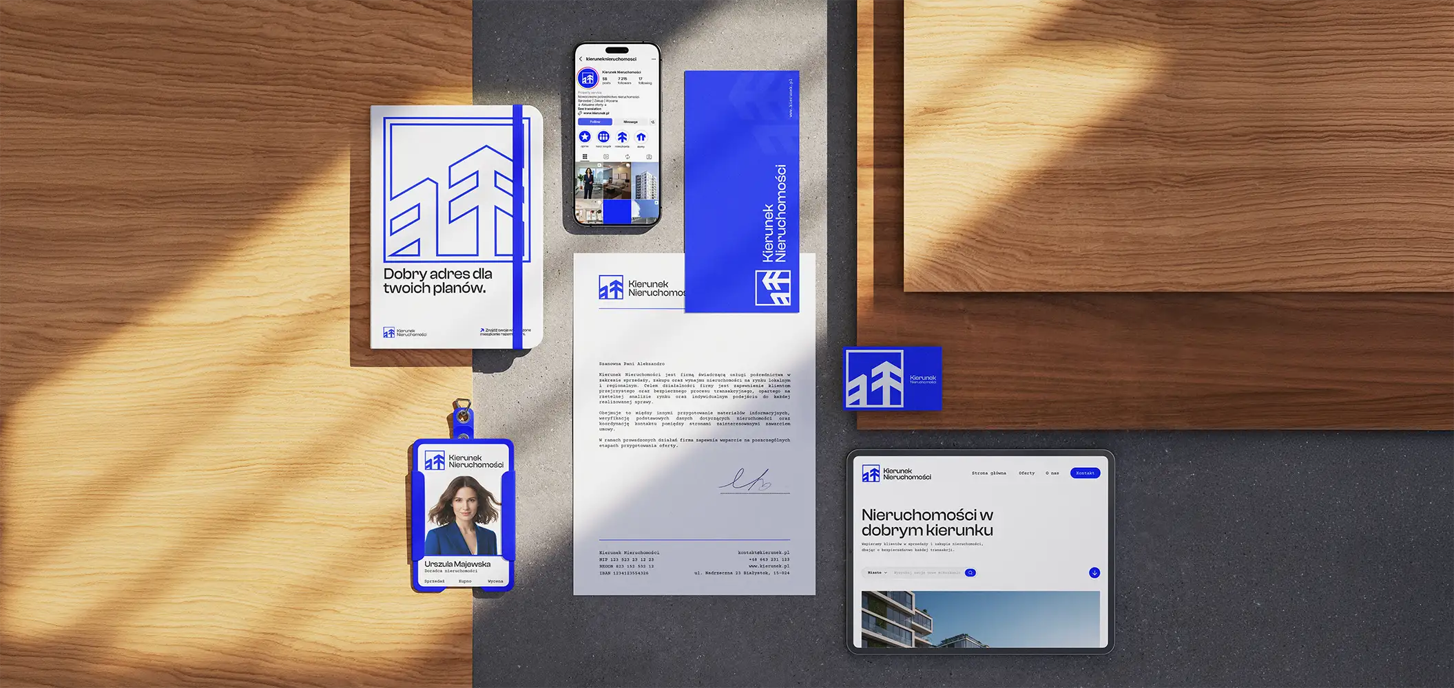
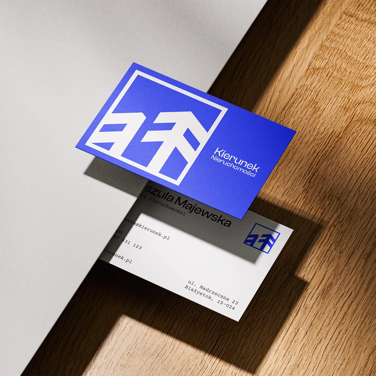
From the start, I built the entire system around everyday use, primarily across materials like business cards and stationery. Everything had to be legible and communicate the transparency of the company.
The result is a brand that commands trust and targets large projects, while remaining approachable and working just as well in everyday client interactions.