Boian Studio
[ HOME ] [ WORK ] [ ABOUT ME ] [ CONTACT ] POLSKI*
soma-banner

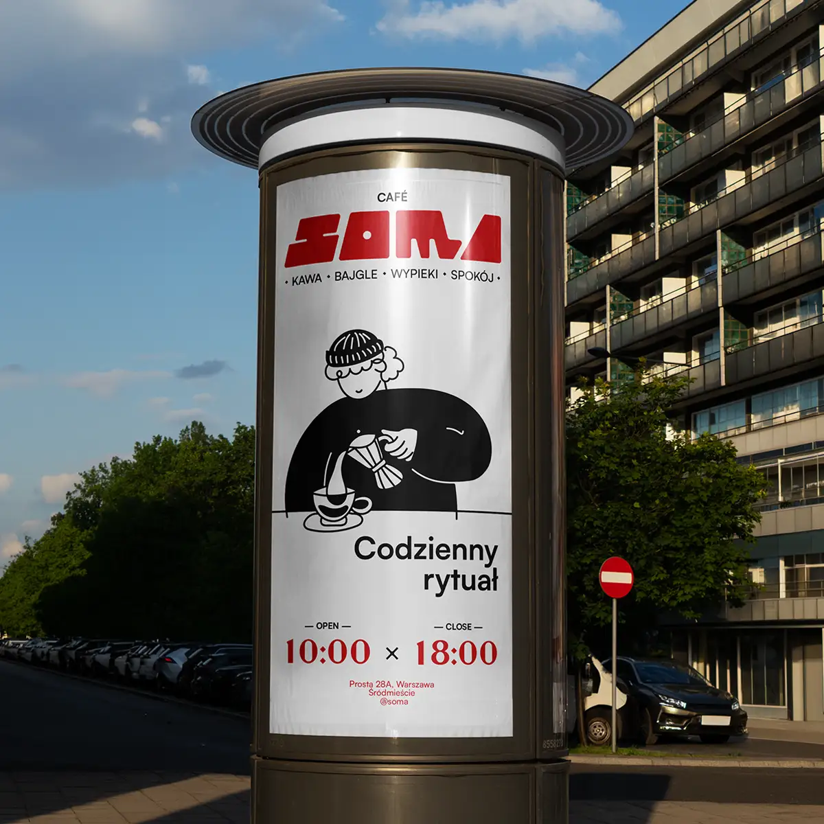
BRANDING FOR SOMA CAFÉ

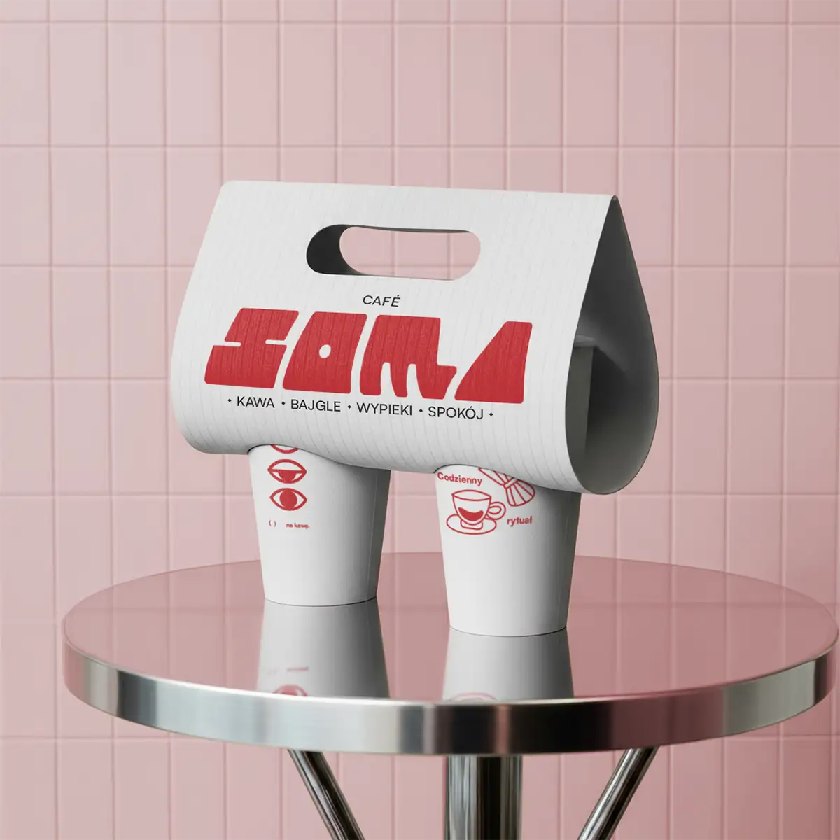
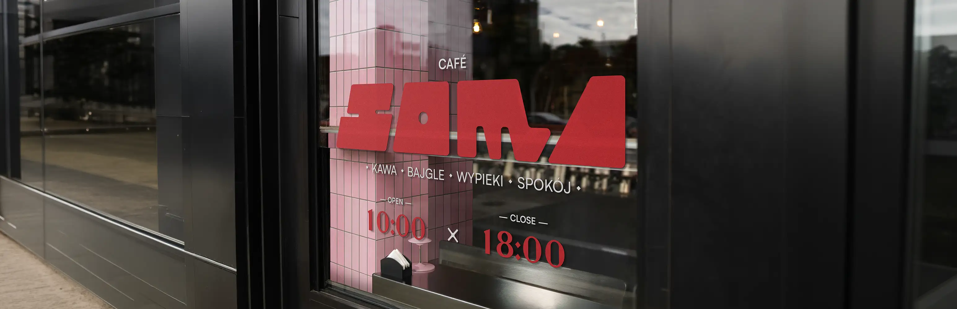
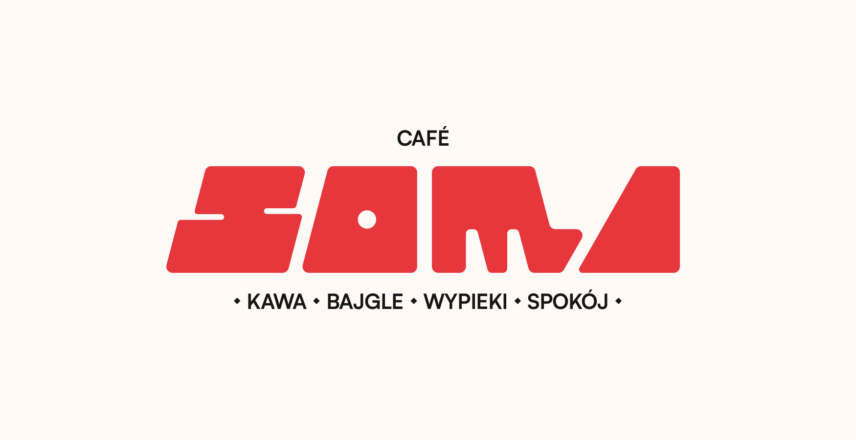
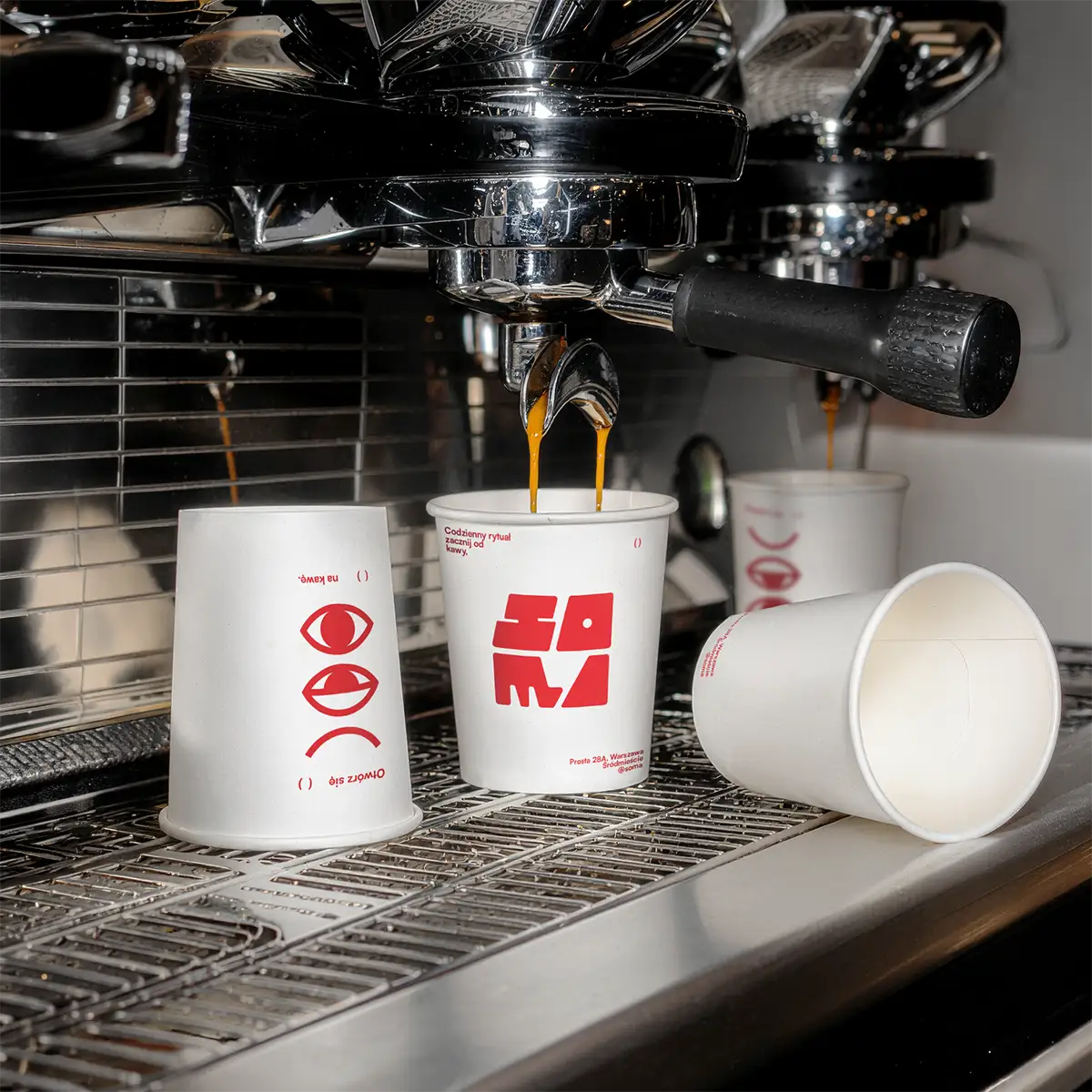
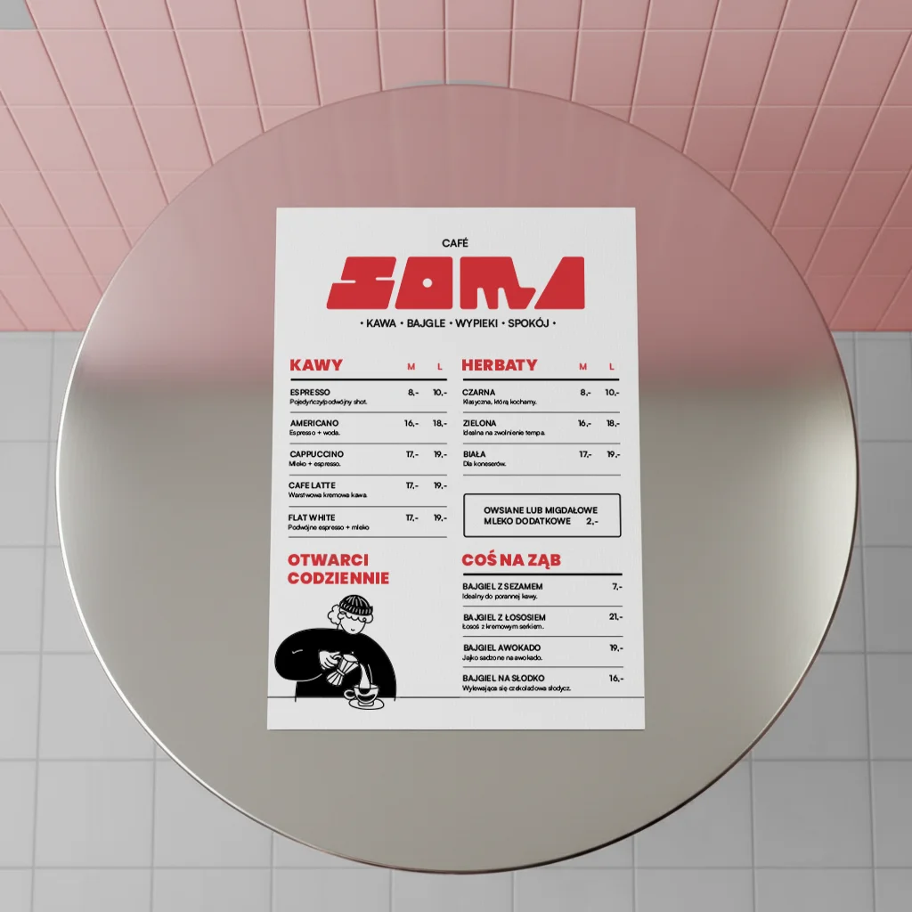
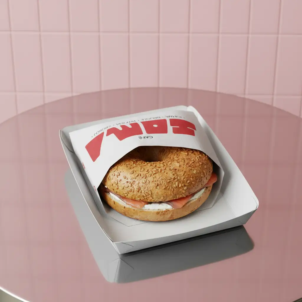
This identity project was created for a bakery-cafe with ambitions to own its local market. The angular logotype gives the brand a crafted, artisanal character wrapped in a modern form. The red and pink were chosen to be instantly recognisable alongside the logo.

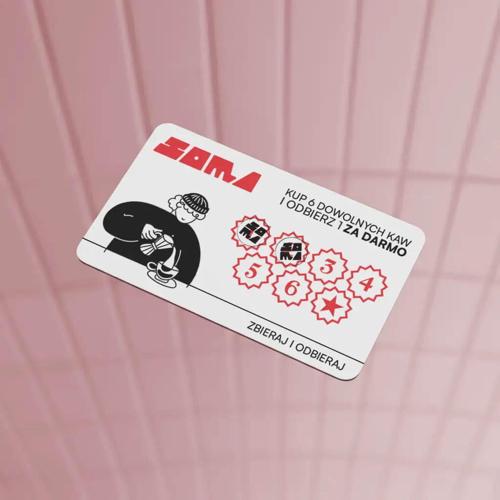
The branding for SOMA had to work across a variety of surfaces, from storefront windows to cups and promotional merchandise, all in support of the product and its sales.

WHY SOMA?

The name SOMA was chosen to be short, easy to remember and pleasant to say. I wanted it to instantly communicate the feeling of a modern place where you actually want to stop and stay for a coffee.

Right from the start, the brand was built to become a new cult spot on the city's map.

IT'S NOT OVER YET...

If you want to get to know my style better, take a look at my other projects.

See more.

Email me at:

[
HELLO@BYBOIAN.COM
HELLO@BYBOIAN.COM
]

or

contact me via the form.
Michał Bojanowski Studio 2026 ©