Boian Studio
[ HOME ] [ WORK ] [ ABOUT ME ] [ CONTACT ] POLSKI*
wielcon-banner

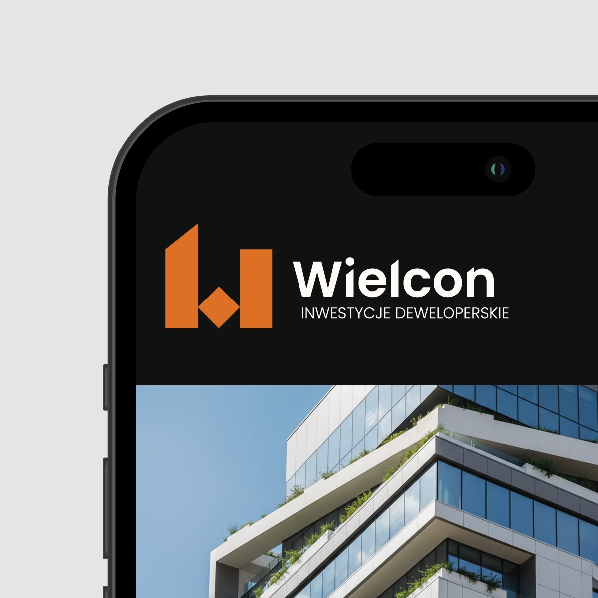
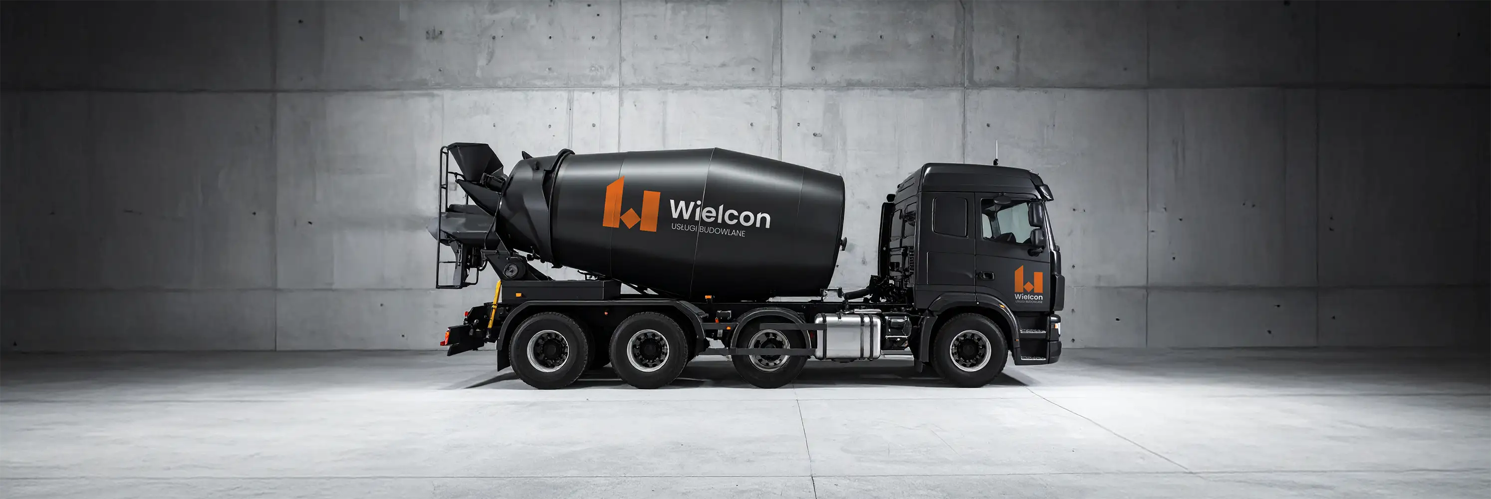
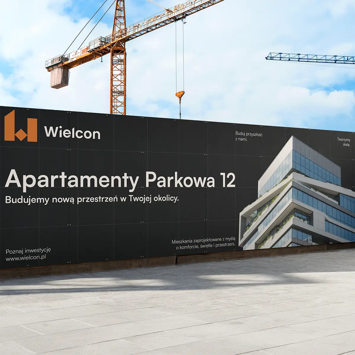
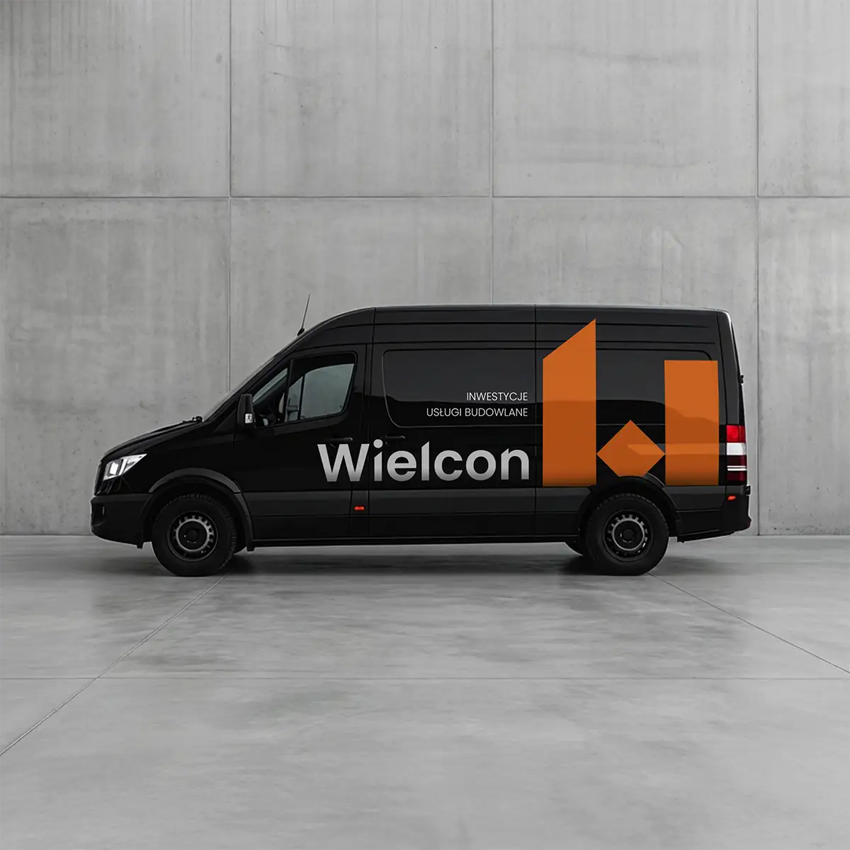
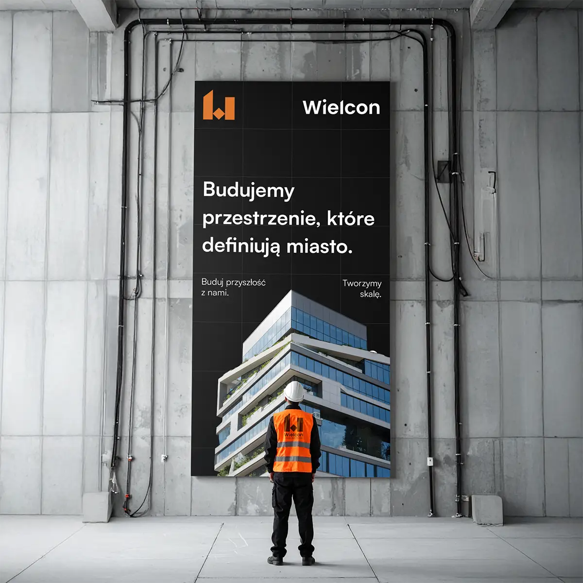
A BRAND BUILT ON SOLIDITY

The goal of the Wielcon project was to create a clear, cohesive identity that captures the scale and character of a brand operating in the construction and investment space. The core idea was to build an image rooted in sharp shapes and precision.

A strong mark and minimalist typography set against raw materials create a brand identity built on solidity, establishing trust between the company and its clients.

VISIBLE AT EVERY SCALE

The system was designed to work across all environments, from large formats like banners and construction site signage to vehicles and heavy equipment. Sharp shapes and high-contrast colours ensure legibility even from a distance.

A consistent visual language builds brand recognition regardless of context or scale, making the mark clear and instantly identifiable in any situation.

IT'S NOT OVER YET...

If you want to get to know my style better, take a look at my other projects.

See more.

Email me at:

[
HELLO@BYBOIAN.COM
HELLO@BYBOIAN.COM
]

or

contact me via the form.
Michał Bojanowski Studio 2026 ©